
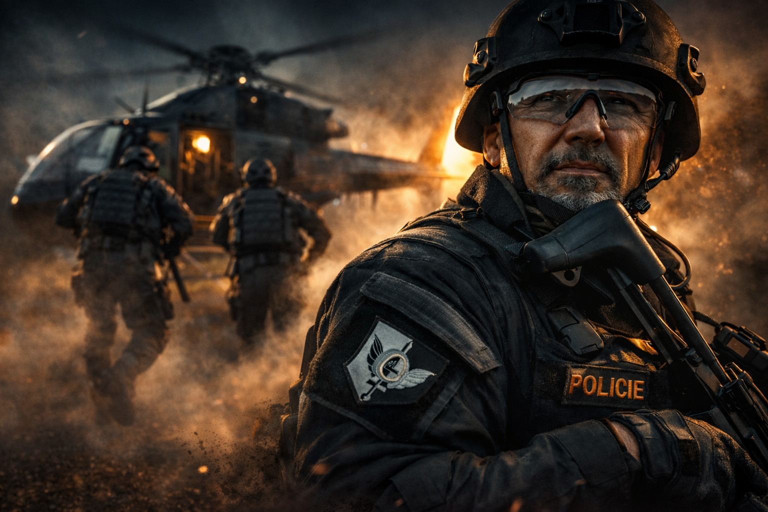
From the portfolio it is clear that the main building block is not subject matter, but light. Light here is not a technical tool. It is structure. It models space, defines emotion and separates reality from stylisation. The visual signature emerges precisely here — in the decision about where the light comes from and what is allowed to remain in darkness.
Every image is constructed in preproduction. It has its own logic, light, space and the precise moment it carries. The resulting photograph is not a capture of reality, but its controlled construction.
Light as the Architecture of the Image
The work with light is rigorously defined — every ray has a clear source and logic. It is not about the aesthetics of 'nice lighting', but about constructing volume.
- Light comes from one dominant direction and creates deep, controlled shadows
- Accentuates cheekbones, jawline and the texture of materials
- Separates the subject from the background with a subtle rim light
- Works with atmosphere — smoke, dust, fog, light particles
Shadows are not a problem to eliminate. They are a tool that separates, defines and guides the eye. The result is a plastic, almost tangible image. Figures do not feel flat. They have weight.
Light is not a tool for me. It is construction. It defines space, models the figure and determines emotion. Every ray has direction, every shadow plane has a reason. The image is not chance. It is built.
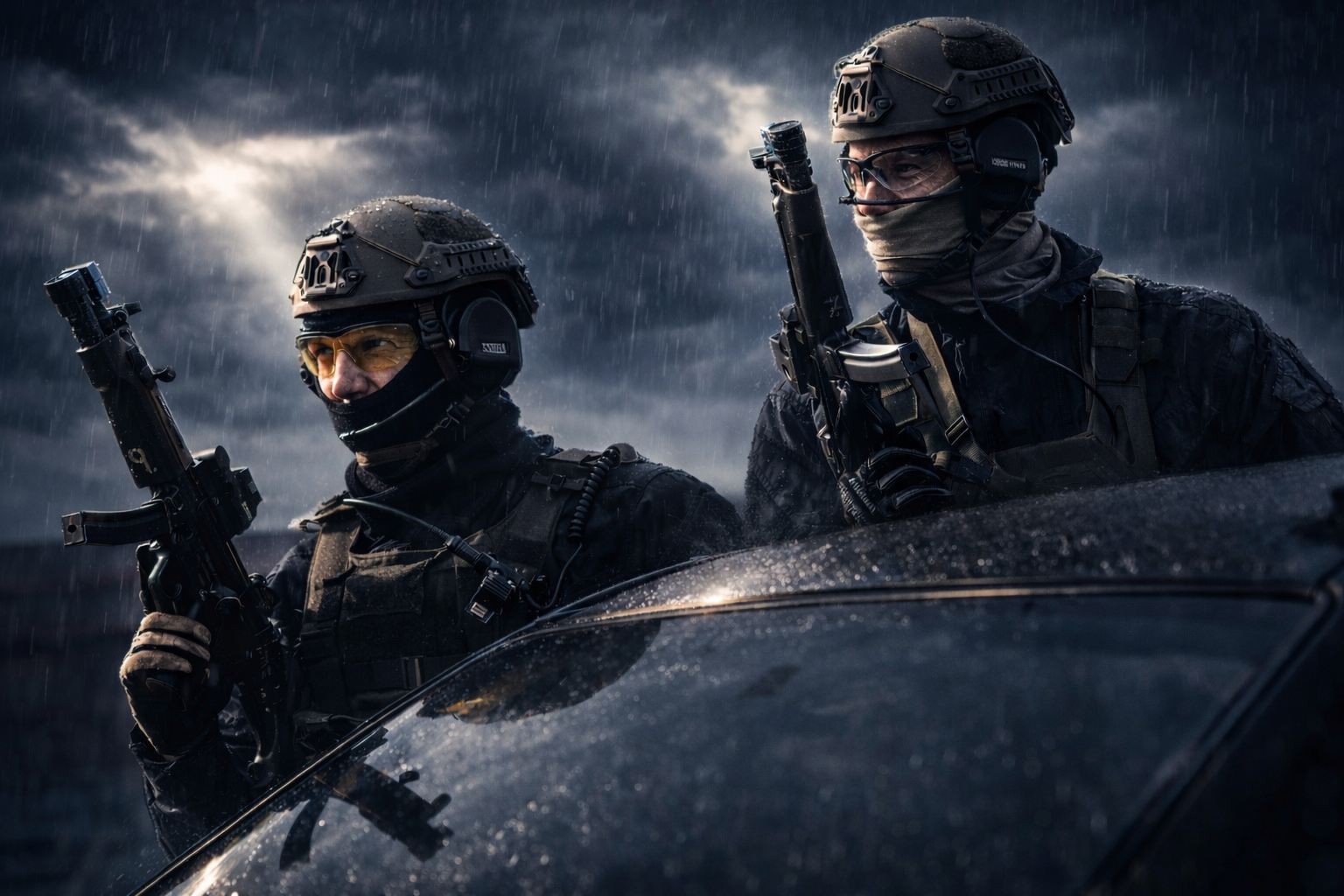
Light · Tactical Production · Freemason.cz
Controlled Contrast of Two Worlds
The colour palette is consistent and legible across the entire portfolio. Two opposing poles dominate — and their collision is not accidental. It is a signature.
Warm spectrum
- Orange, fire, golden tones
- Sunset, glowing metal
- Energy · destruction · life
Cool spectrum
- Blue, cyan, steel shades
- Night, fog, shadow
- Control · calm · distance
These two registers meet within a single image. Warmth represents energy, cool represents control. The result is a visual language that works immediately — without explanation.
A Carrier of Tension, Not a Model
The people in the images are not 'models'. They are carriers of situation. Whether it is a fashion portrait or a military scene, the figure always feels like someone who has control of the situation — even when surrounded by chaos.
- Expression is focused, understated — emotion is beneath the surface, never overplayed
- Body is firm, stable, slightly turned
- Gaze has weight — it is neither empty nor arranged
The figure is not decoration. It is a fixed point. Calm, focused, without performance. It does not feel like someone posed for a photograph — but like someone who is a natural part of the space they inhabit.
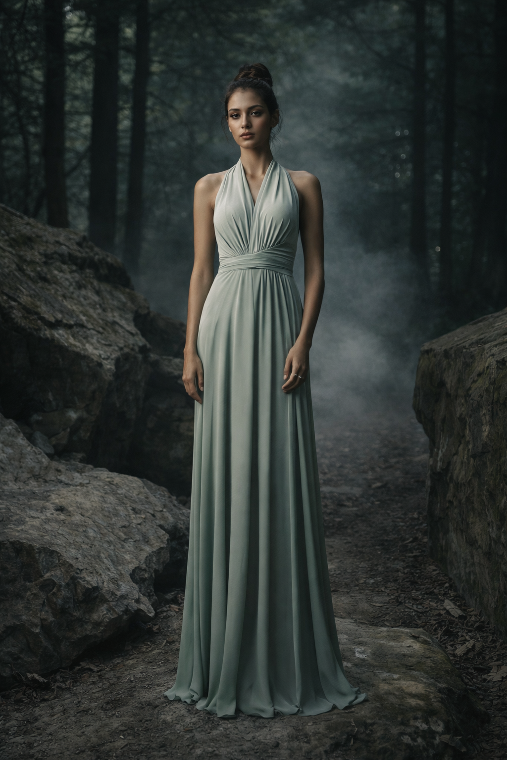
Fashion Editorial · Freemason.cz · Prague
Cinematic Reality, Not a Backdrop
The environment is not background. It is an active component of the image. Industrial locations, military scenes, architectural interiors or abstract light spaces — each carries a physical reality that gives the image weight and authenticity.
Military and action environments are not stylisation. They are sources of physical presence that contrast with precise, disciplined composition. In this collision of two worlds — fashion discipline and raw military reality — a visual language emerges that is immediately recognisable.
The image works on the principle of three planes: the foreground carries texture, the main subject holds tension, the background builds space through light, smoke and movement. This is why the images breathe and have cinematic perspective.
The Moment Just Before — or After
A large part of the work deals with time. It does not capture the action itself. It captures the moment:
- Just before the explosion
- Just after impact
- In the instant when something breaks
The viewer does not receive an answer. They receive a situation. They must read it. And it is precisely this that draws them into the image — they become part of it.
This tension — present,
but unexplained —
is the primary carrier of force.
Cross-Genre as Signature
The portfolio shows that the work does not operate in a single genre, but combines them in a way that creates a unique register:
- Fashion × cinematic — fashion precision in a cinematic space
- Portrait × storytelling — a face as a fragment of a story
- Military × editorial aesthetics — authenticity in precise composition
- Reality × stylisation — reality, but concentrated
The image works simultaneously as a fashion photograph and a cinematic frame.
Six Principles of the Signature
The work is built on controlled light that models the figure in a space full of tension, where cold discipline meets explosive energy, and every image feels like a fragment of a larger, unspoken story.
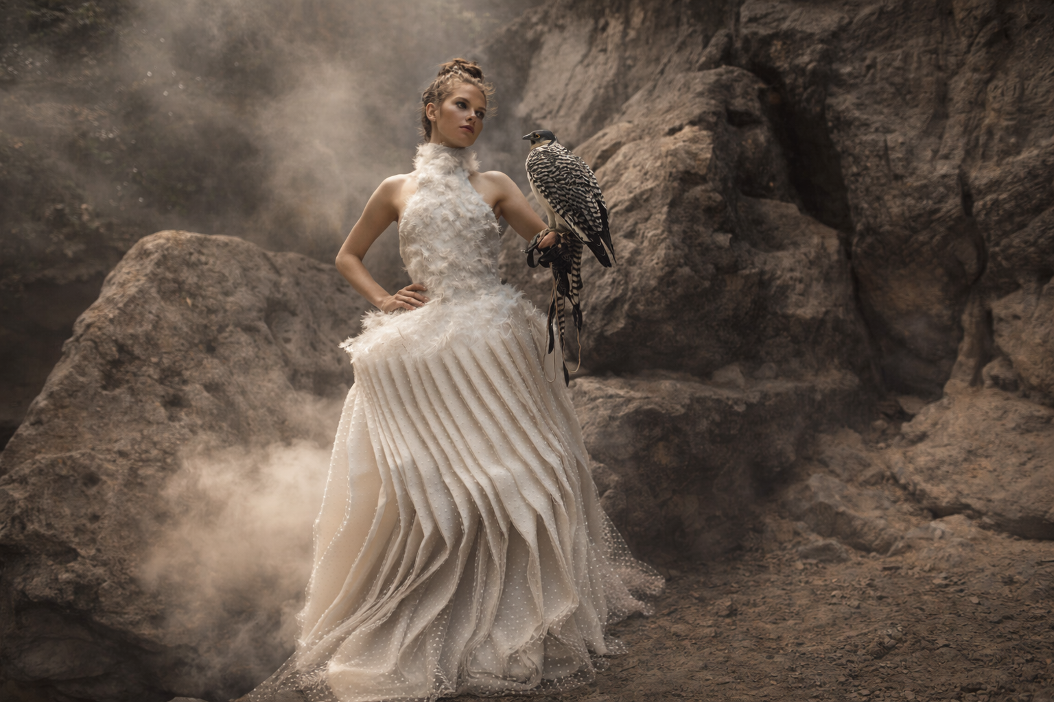
Scenic Production · Freemason.cz
We do not create images that merely look good. We create images that have weight.
Our work is built on tension between two worlds — the controlled elegance of fashion aesthetics and the raw reality of action and military scenes. One brings discipline, the other energy. One brings form, the other truth. The result emerges precisely at their boundary.
Light is not a tool for me. It is construction. It defines space, models the figure and determines emotion. Every ray has direction, every shadow plane has a reason. The image is not chance. It is built.
I work with contrast as the fundamental language. Warmth against cool. Calm against explosion. Silence against movement. The figure stands at the centre as a fixed point — focused, present, unshakeable. It is not a pose. It is a state.
Military and action elements are not stylisation. They are sources of physical reality that give the image authenticity and tension. Fashion enters as control, clarity and precision. It is precisely in this collision that a visual emerges that does not feel like a photograph, but like a moment from a larger story.
I do not capture narrative. I capture the moment when something breaks.
Every image has depth. Foreground, subject, space. Every layer has a function. Nothing is superfluous. Nothing is accidental. Everything leads toward the visual holding together as a whole and functioning immediately.
This is not aesthetics for effect. It is controlled intensity.
Fashion control. Military reality. Cinematic tension.
A Visual That Works — Not Just Exists
Behind the visual force lies a high degree of control: precise work with contrast, clean tonality without chaos, detailed retouching with preserved texture, clearly guided composition. Nothing feels accidental. Even chaos is controlled.
The result is not just powerful images, but visuals that work. They are legible, memorable and have a clear identity. They do not blend in. They stop. They hold attention. They create an impression of value and quality without explanation.
This approach is transferable to commercial projects — from premium campaigns through branding to the visual communication of products and services that need to appear confident, strong and authentic.
In an age of visual overload, what matters is not how many images are created. What matters is the force they carry.
Freemason.cz does not build solely on how things look. It builds on how they act. How they attract attention, how they build brand identity and how they hold their own in an environment where most visual content blurs together.
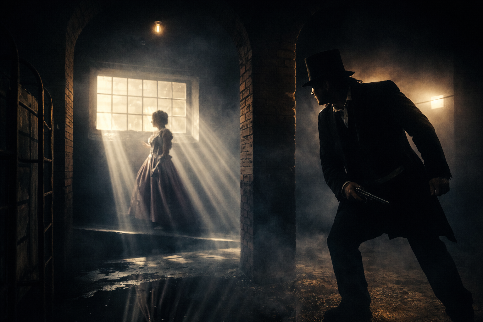
Special Projects · Freemason.cz · Prague
Because an image is not chance. It is construction.
And quality is the result of control, not luck.
Freemason.cz has been building a consistent visual language since 2011 — one with clear rules: light, composition, intent — and space for development. Every new project extends it, while respecting its foundation. The result are images the viewer remembers. Not for effect, but for how they function.